Reflection
It was important to me to design a portal that feels clear, thoughtful, and genuinely supportive of the people using it every day.
On a personal level, this project also reflected something I truly enjoy as a designer, creating characters. I have always loved illustration, and the robots gave me the chance to bring warmth, personality, and a more human feeling into the experience.


Employee
Portal
Mercantile Bank
FinTech | B2E (Enterprise Employee Portal)
Portal
Portal
Employee
Portal
Mercantile Bank
FinTech | B2E (Enterprise Employee Portal)
FinTech | B2E (Enterprise Employee Portal)
Employee
Portal
Mercantile Bank
FinTech | B2E (Enterprise Employee Portal)
FinTech | B2E (Enterprise Employee Portal)
Employee
Portal
Mercantile Bank
FinTech | B2E (Enterprise Employee Portal)
FinTech | B2E (Enterprise Employee Portal)
The Mercantile Bank employee portal is the bank’s internal hub for daily communication, news, tenders, departmental content, and employee resources.
When I approached this project, I quickly realized that the challenge was not only visual. The portal already contained important information, but the experience felt cluttered, generic, and emotionally flat.
My goal was to redesign the portal in a way that would help employees find information faster, understand where they were more easily, and feel that each department had a clearer identity within one shared system.
My goal was to redesign the portal in a way that would help employees find information faster, understand where they were more easily, and feel that each department had a clearer identity within one shared system.
Redesigning an internal system to make it clearer, more structured, more human
Redesigning an internal system to make it
clearer, more structured, more human
UX/UI Design
Redesign
Web
My Role
Tools Used


Tools Used
Redesigning an internal system to make it
clearer, more structured, more human
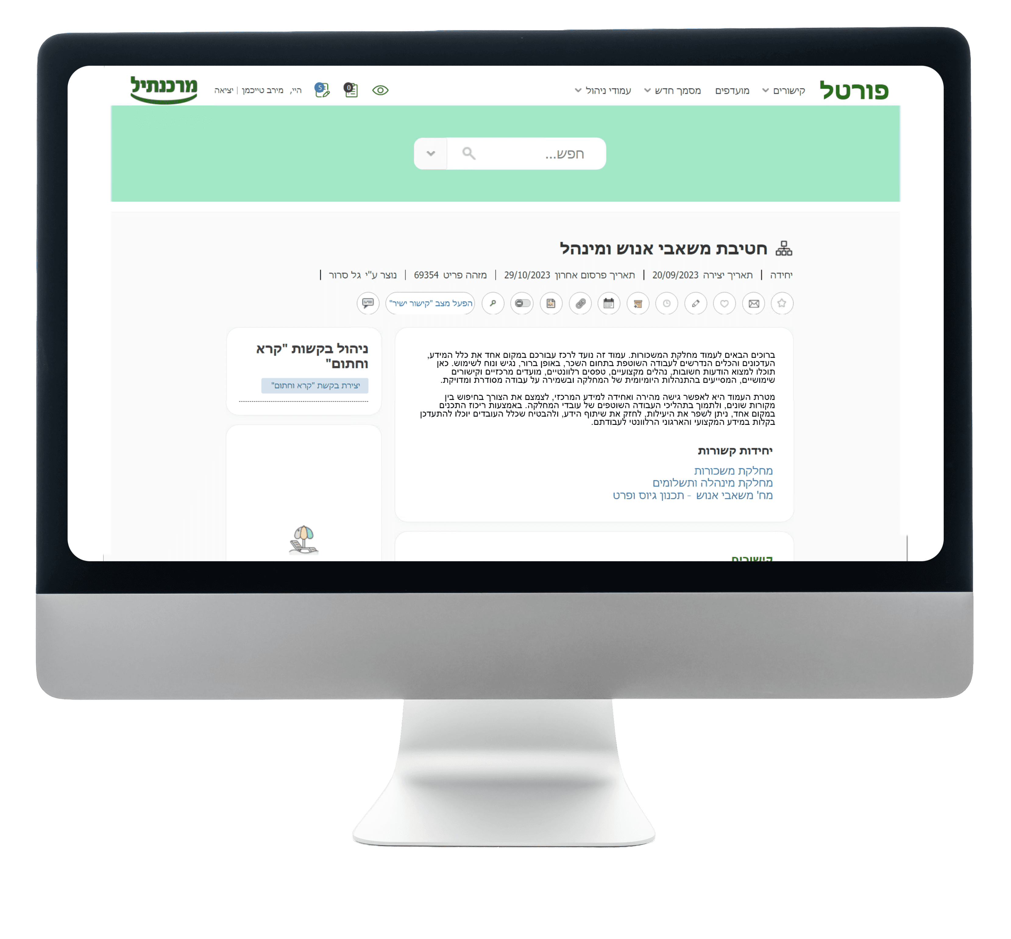
The original portal felt outdated and difficult to navigate.
l though it contained a large amount of internal information,
the experience lacked hierarchy,
visual clarity, and a strong sense of orientation.
The original portal felt outdated and difficult to navigate.
l though it contained a large amount of internal information,
the experience lacked hierarchy,
visual clarity, and a strong sense of orientation.
The original portal felt outdated and difficult to navigate.
l though it contained a large amount of internal information,
the experience lacked hierarchy,
visual clarity, and a strong sense
of orientation.
Important content
did not feel prioritized
Pages suffered from poor scan-ability due to a lack of visual structure
The experience felt functional, but not inviting or memorable
Important content
did not feel prioritized
Pages suffered from poor scan-ability due to a lack of visual structure
The experience felt functional, but not inviting or memorable
Several issues stood out:
Problems
Solution 1
Clearer hierarchy
Create a stronger information hierarchy
so employees could understand what matters first
Solution 2
Better scanability
Improve scanability and orientation
so users could move through content-heavy pages more easily
Solution 3
Department Identity
Give departments a stronger
visual identity so the portal would feel more memorable, more human, and less generic
My Design Solutions
To solve these issues, I focused on a set of design decisions that made the portal easier to understand and more meaningful to use.
Clearer hierarchy
Clearer hierarchy
I reorganized content areas so employees could immediately understand where they were, what the page was about, and which information mattered most.


Better scan-ability
Better scan-ability
I introduced cleaner modular layouts, clearer spacing, and more structured content zones to reduce cognitive load and make dense pages easier to move through.
Department Identity Through
Structure and Visual Language
Department Identity Through
Structure and Visual Language
Each department needed to feel distinct within one shared system.
To support that, I combined consistent page structures with a dedicated robot system that gave each area a clearer and more recognizable identity.

Page structures
Robot System
for recognizable identity
My Design Solutions
To solve these issues, I focused on a set of design decisions that made the portal easier to understand and more meaningful to use.
One of the design conflicts in the Mercantile Bank employee portal project focused on the homepage.
My first concept, set the initial visual direction, but the client felt the layout gave too much weight to the photo gallery and field updates, and wanted more space for articles and written content.
A second discussion involved the search bar placement. My original intention was to position it directly on the hero image to make it more visible and modern, but after initial concerns about adapting changing banner images around it, I moved it to a separate bar above the header. After checking the issue with the bank’s IT team and knowledge management department, I confirmed that placing the search on the image would not create a problem, so I returned to that solution.
Managing this conflict meant balancing client feedback with my own design rationale, validating assumptions with stakeholders, and refining the homepage into a solution that was both more practical and more visually effective.
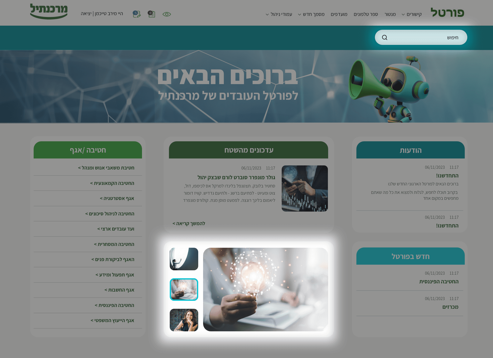
Before
Before
After
After
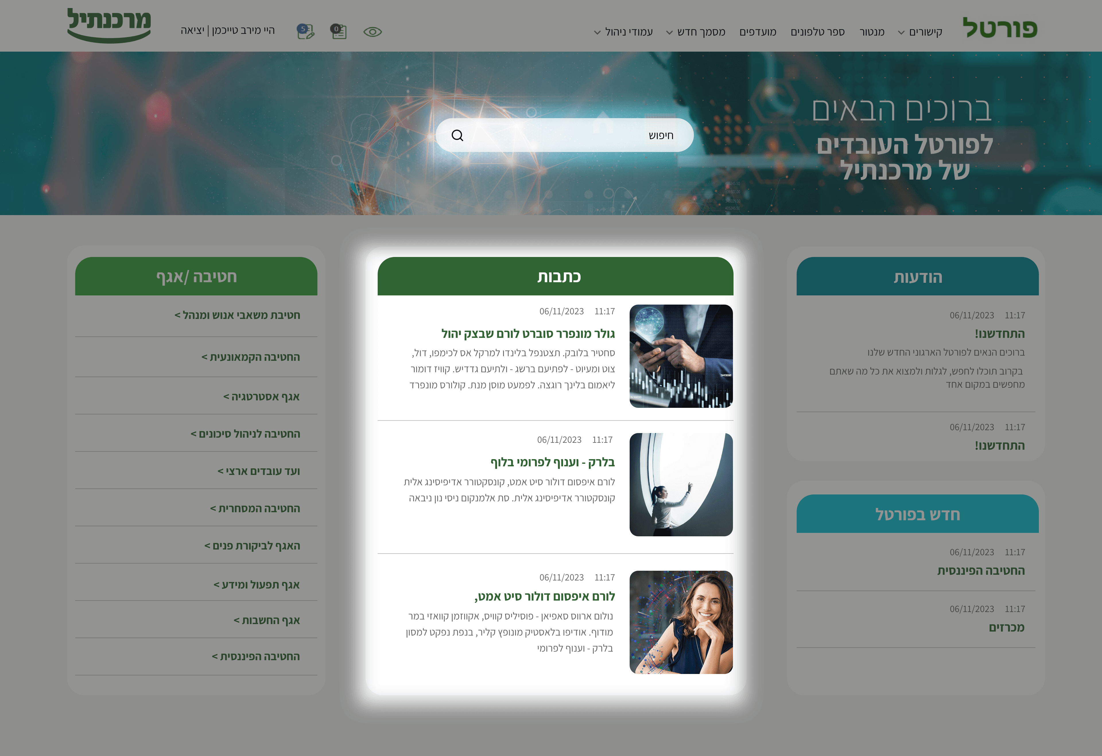
Managing Design Conflict
Managing Design Conflict
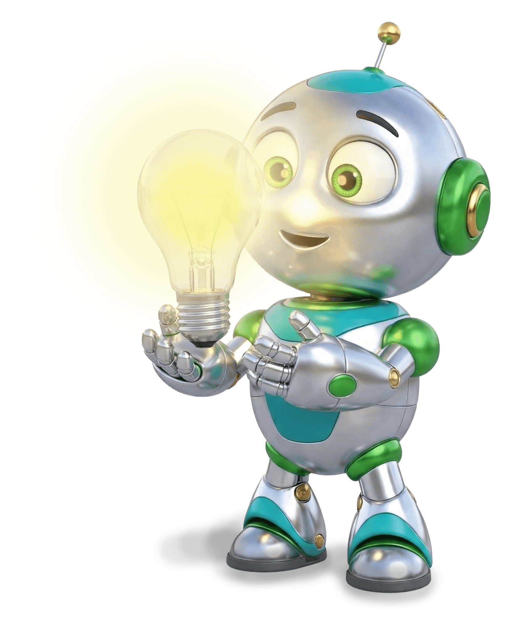
What started as a visual layer became one of the strongest identity-building elements in the portal.
The robot system allowed me to give each department its own tone and presence, making the experience feel more specific and less like one uniform internal interface.
What started as a visual layer became one of the strongest identity-building elements in the portal.
The robot system allowed me to give each department its own tone and presence, making the experience feel more specific and less like one uniform internal interface.
This was important not only from a branding perspective, but also from a user experience. In a large internal system, employees return again and again to the areas that are relevant to their own role.
By giving each department a dedicated character, I created stronger visual recognition and a clearer sense of place across the portal.
The robots helped differentiate departments, support orientation, and add personality to a system that could have otherwise felt anonymous or purely functional.
Beyond their navigational role, they introduced an emotional layer into the experience, turning a static, text-heavy portal into something warmer and more engaging. Their friendly, positive expressions were designed to subtly influence the emotional tone of the interface, helping boost morale and create a more welcoming daily experience for employees. In that sense, the robots became more than illustrations; they became part of the portal’s internal language, shaping both usability and emotional connection.

Meet the Departments
Meet the Departments
Meet the
Departments

To bring the robot series to life,
I utilized AI to assist in the design process
To bring the robot series to life,
I utilized AI to assist in the design process
To bring the robot series
to life,
I utilized AI to assist in the design process

HR & Administration
Division

Financial
Division

Retail
Banking

Operations &
Information

Knowledge
Management

Legal Advisory
Division

Announcements

Tenders

Accounting
Division

Risk Management
Division

Commercial
Division

Home

Strategy
Division

National Employees’
Committee

Audit
Division


The robot language evolved in two stages. In the first version, I focused on giving each department its own personality through a dedicated robot. At the time, AI image tools were still relatively limited in their ability to generate a fully consistent character across multiple poses and scenarios, so while the bank responded very positively to the concept, the visual system itself was less unified than I wanted.
The robot language evolved in two stages. In the first version, I focused on giving each department its own personality through a dedicated robot.
At the time, AI image tools were still relatively limited in their ability to generate a fully consistent character across multiple poses and scenarios, so while the bank responded very positively to the concept, the visual system itself was less unified than I wanted.
As I revisited the project over time, I realized these robots were not just supporting illustrations, they were becoming the visual identity of the portal. That shift made consistency much more important.
In the second version, I refined the character system so the robot remained recognizably the same across departments, while only the role-specific elements changed. This made the language feel more intentional, more branded, and more scalable as a long-term internal identity.
HR & Administration
Division
Financial
Division
Retail
Banking
Operations &
Information
Knowledge
Management
Legal Advisory
Division
Announcements
Tenders
Accounting
Division
Risk Management
Division

Compared to the previous design, I introduced a clearer modular layout,
stronger separation between content types, and a more defined visual rhythm across the page.
The central content area became easier to identify, side modules gained clearer purpose,
and the overall composition feels less crowded and more cohesive.
I also refined the use of color, spacing, and card structure so the homepage would feel
lighter and easier to scan. This helped transform the screen from a collection
of separate blocks into a more unified and navigable experience.
Bringing Structure
to the Homepage
Bringing Structure
to the Homepage


Not
prioritized
Not
prioritized
This was important not only from a branding perspective, but also from a user experience. In a large internal system, employees return again and again to the areas that are relevant to their own role.
By giving each department a dedicated character, I created stronger visual recognition and a clearer sense of place across the portal.
UX/UI Design
Redesign
Web
My Role
Tools Used
Compared to the previous design,
I introduced a clearer modular layout, stronger separation between content types, and a more defined visual rhythm across the page.
The central content area became easier to identify, side modules gained clearer purpose,
and the overall composition feels less crowded and more cohesive.
I also refined the use of color, spacing, and card structure so the homepage would feel
lighter and easier to scan. This helped transform the screen from a collection
of separate blocks into a more unified and navigable experience.
Bringing Structure
to the Homepage
Employee
Portal
Mercantile Bank
Clearer hierarchy
I reorganized content areas so employees could immediately understand where they were, what the page was about, and which information mattered most.
Better scan-ability
I introduced cleaner modular layouts, clearer spacing, and more structured content zones to reduce cognitive load and make dense pages easier to move through.
My Design
Solutions
To solve these issues, I focused on a set of design decisions that made the portal easier to understand and more meaningful to use.
One of the design conflicts in the Mercantile Bank employee portal project focused on the homepage.
My first concept, set the initial visual direction, but the client felt the layout gave too much weight to the photo gallery and field updates, and wanted more space for articles and written content.
A second discussion involved the search bar placement. My original intention was to position it directly on the hero image to make it more visible and modern, but after initial concerns about adapting changing banner images around it, I moved it to a separate bar above the header. After checking the issue with the bank’s IT team and knowledge management department, I confirmed that placing the search on the image would not create a problem, so I returned to that solution.
Managing this conflict meant balancing client feedback with my own design rationale, validating assumptions with stakeholders, and refining the homepage into a solution that was both more practical and more visually effective.

Before
After

Managing Design
Conflict
Department Identity
Through Structure
and Visual Language
Each department needed to feel distinct within one shared system.
To support that, I combined consistent page structures with a dedicated robot system that gave each area a clearer and more recognizable identity.
Page structures
Robot System
for recognizable identity